
|
|
|
|
|
|
|
|
|
|
|
|
|
|
|
|||||||
|
|
|
|
|
|
|
|
|
||
Temperature
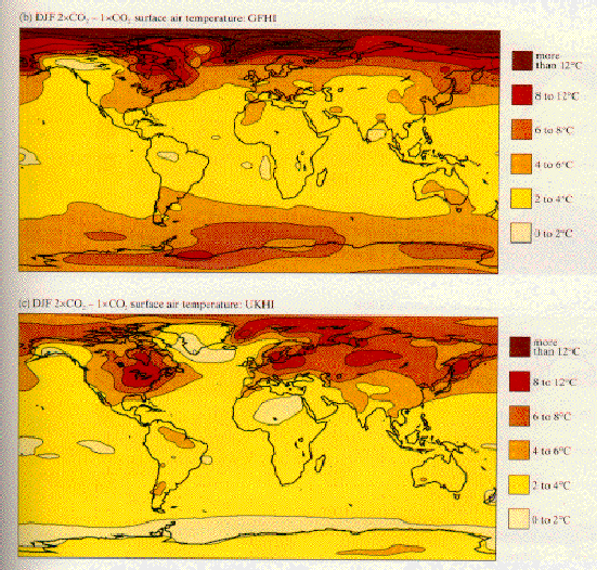
The most notable features in the first graphs for
December-January-February (DJF) temperature change (Figure 8) are the dominance of
warming at high latitudes, particularly in the Northern Hemisphere. Both
models agree that the Northern Hemisphere polar region warms substantially
(more than 8oC over wide areas) but the exact boundaries of the areas are
different. Also, the GFHI simulation shows more intense warming at the
North Pole and less difference in warming between land and water areas at
high latitudes. The models disagree on the fate of warming over
Antarctica. This is not surprising in view of the wide model disagreement
over the pressure and circulation patterns over this part of the globe, as
previously discussed. Both models report only weak warming in tropical
areas.
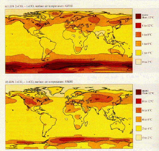
Simulations of warming due to doubling of CO2 for June-July-August (JJA) are given in Figure 9. Compared to the previous graph, the GFHI simulation shifts the maximum warming to the Antarctic ice margin in keeping with the shift to winter in the Southern Hemisphere. The UKHI model calculates less warming, although the site of maximum warming is similar to that of the GFHI map. Tropical regions again show little warming.