
|
|
|
|
|
|
|
|
|
|
|
|
|
|
|
|||||||
|
|
|
|
|
|
|
|
|
||
Model Comparison
We now follow the strategy outlined in the pinball analogy where we
first examine how well the model simulates the characteristics of the
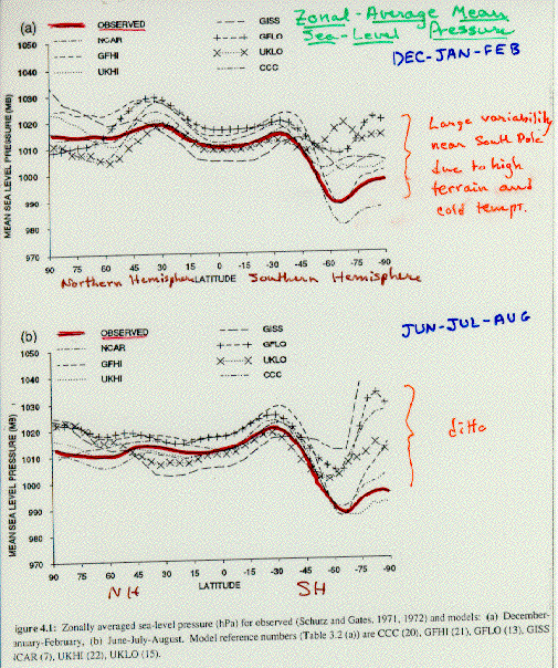
present global climate. Figure 7 shows the zonally averaged
sea-level pressure. The horizontal axis on this plot gives the latitude
from the North Pole (90o) to the South Pole (-90o). The upper graph gives
the December-January-February (DJF) averages, and the bottom plot gives
June-July-August (JJA) values. Each curve represents a different global
climate model, including the results from the National Center for
Atmospheric Research (NCAR), Geophysical Fluid Dynamics Laboratory
high-resolution model (GFHI), United Kingdom Meteorological Office
high-resolution model (UKHI), NASA Goddard Institute for Space Studies
(GISS), Geophysical Fluid Dynamics Laboratory low-resolution model (GFLO),
United Kingdom Meteorological Office low-resolution model (UKLO), and the
Canadian Climate Centre (CCC). All models use the same basic equations in
simulating climate, but differ in how they parameterize effects of clouds,
radiation, and surface features. The red lines in each of the plots give
the observed zonally averaged sea-level pressure against which results of
all models are to be compared.